MY BUSINESS
IS TO CREATE...
–Wm. Blake
christopher martiniano | creative | insights | strategy | ideas
_Hello. My name is Christopher Martiniano. My curiosity has led me on a lateral, creative career as a designer, art director, copywriter, and creative director. As a PhD/ABD, I am also a professor of writing, theory, literature, art, and creativity studies. Ultimately, I am a student. I am always learning. And it seems, I am always obsessively doing. When people ask what I do, I inevitably say, “I learn about things. I make stuff. I create ideas. I figure things out.” Scroll down to see a few of those ideas and some of that stuff. For a more comprehensive look, download my book.
| christophermartiniano@gmail.com | 773.750.6660
Working with the talented team at Turner Duckworth (UK), who evolved Sprite’s identity to transform it into an “icon brand”, we applied the brand’s new look to its stable of sponsorships including the NBA (LeBron James). The goal was to “surprise and delight” consumers with a simple, consistent, but “unpredictable” visual presence.

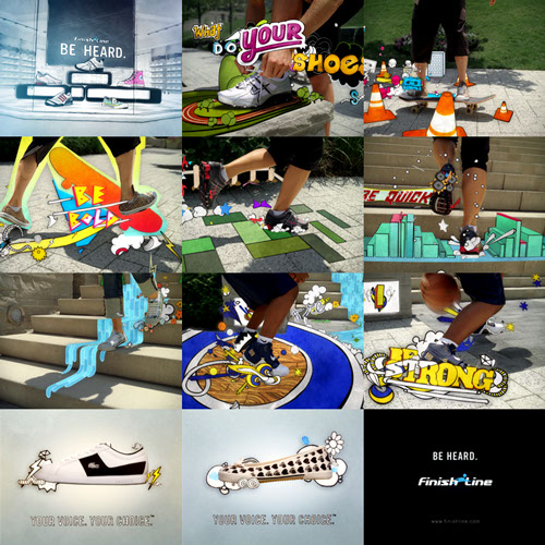
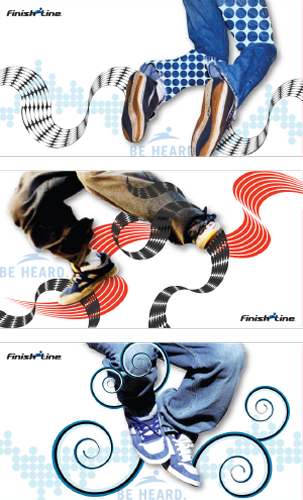
Finish Line wanted to move from the performance category of athletic footwear into style and expression. The copy I wrote demanded a similarly bold, visual expression of the shoes and their “aura.” I simply asked my team, what would shoes “say” and what would that language “look like?” Besides broadcast, print, and digital media, we also had to transform their retail space into a more vibrant, dynamic, and colorful environment. Working with the talented and tireless team at Digital Kitchen, we developed a library of graphics that were both specific to the featured shoes as well as to the brand’s millennial target and their interests.
WATCH TV SPOT

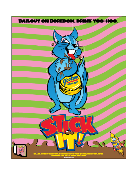
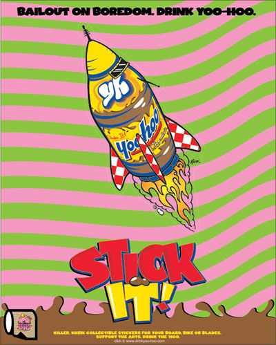
Certainly a quirky brand, Yoo-Hoo is also a proud, badge brand for many teens. We wanted to push its outlier status and also its “in-the-know” identity into its presence at Warped Tour, X-Games, and other teen festivals. We developed the “Stick It!” campaign with the help of punk illustrator and poster designer, Frank Kozik, to create athlete uniforms, unique stickers, posters, and patches for consumers, as well as a unique retail presence to differentiate it from other “staid” soft drinks that often communicate to “mom.”

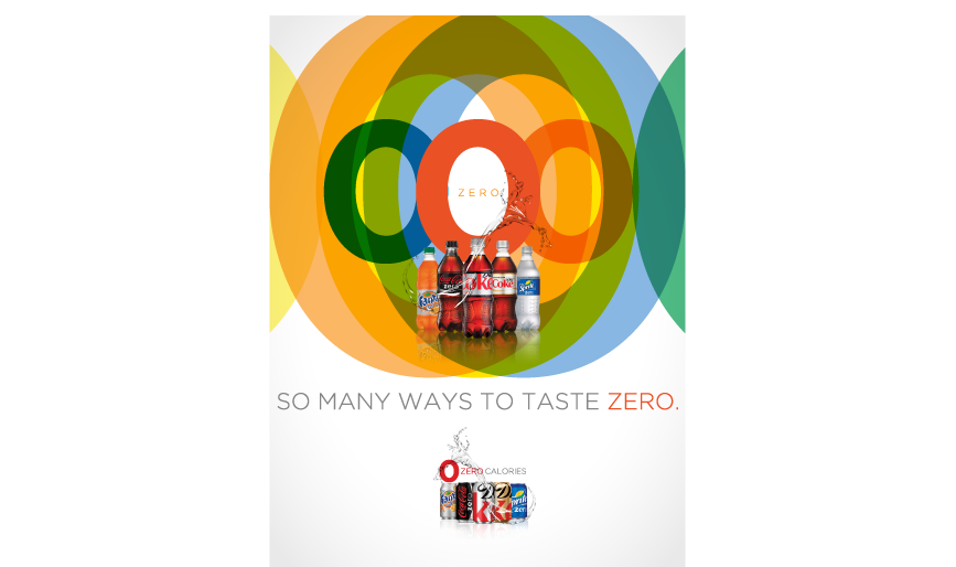
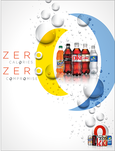
With the “Bloomberg Law”, limiting the size of soda drinks, looming in NYC as well as the antipathy developing towards soda generally, Coca-Cola looked to our team to develop a “family” campaign that visually joined their zero calorie offerings within Coke’s “Bring Joy” campaign. The goal was to visually present the “family” to be as fulfilling and dynamic as their full calorie counterparts, framed by their zero-calorie benefit.


For Miller Lite’s summer promotional window, we recommended a partnership with Jeep to reinforce the freedom of summer. Besides the Wrangler, Jeep’s catalog of promotional elements made for great dealer loaders, retail promotion, and display items. The idea was simple: Independence is a state of mind that moves you to discover and experience the best summer has to offer; the people, the places, the weather, the freedom. Be free to choose better, to make it real and make it Great. Choose Miller Lite, the unbeatable combination of Taste and Refreshment and Jeep, the legendary mix of quality and independence and you’ll be on your way to a better summer - Like it should be.

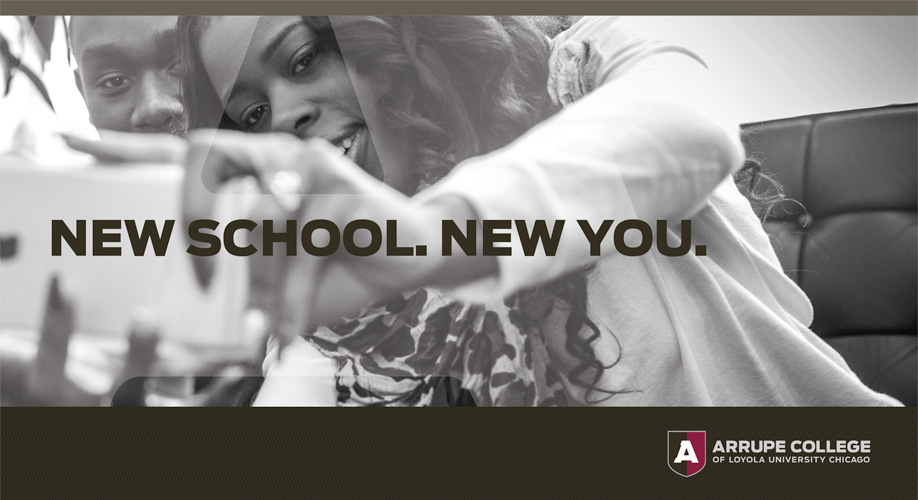
We can often say we launched a new brand, but rarely can we say we helped launch a new college. In the fall of 2015, Arrupe College of Loyola University Chicago opened it's doors to its students. Just eight months prior to that, the college was just an idea. Once we were given the green light, we created the branding, identity system, website, recruiting materials, social media strategy, and school signage in a little less than 5 months. The guiding idea to it all was Arrupe's tagline, "Achievable, Accessible, and Affordable." Arrupe serves gifted, Chicago-area students struggling to find a school to accept them. Arrupe's brand and visual identity system won the Circle of Excellence Silver Award from CASE (Council for Advancement and Support of Education) in 2016.
See representative campaign elements here

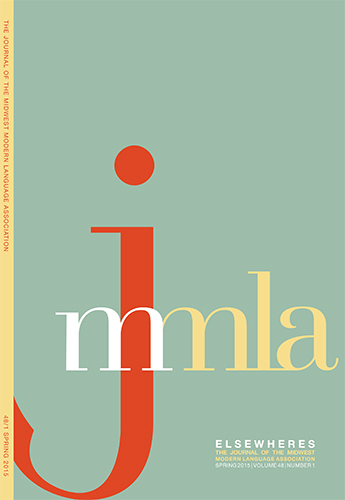
The MMLA (the Midwest, regional chapter of the Modern Language Association), looked to upgrade their identity in order to be more respected as an academic organization, conference, and journal. With the guidance of the executive committee, I redesigned their logos, journal cover and pages, website, conference materials, as well as their social media channels.

christopher martiniano | christophermartiniano@gmail.com | 773.750.6660